How to Boost Conversions with Smart Design
A beautiful website is great, but a website that converts is even better. Conversion-focused design combines aesthetics with psychology and strategy to guide visitors toward taking action.
1. Clear Value Proposition
Visitors should understand what you offer within seconds of landing on your site. Your headline and supporting copy should immediately communicate your unique value. Don't make people work to figure out what you do.
2. Strategic Calls-to-Action
Every page should have a clear primary action you want visitors to take. Make your CTAs stand out with contrasting colors, compelling copy, and prominent placement. Use action-oriented language like "Get Started" instead of generic "Submit."
3. Build Trust with Social Proof
Testimonials, reviews, case studies, and client logos build credibility. Display them prominently, especially near conversion points. Real photos and specific details make testimonials more believable and effective.
4. Simplify Your Forms
Every form field you add decreases conversion rates. Only ask for information you absolutely need. Use smart defaults, inline validation, and clear error messages to make forms as painless as possible.
5. Optimize Page Speed
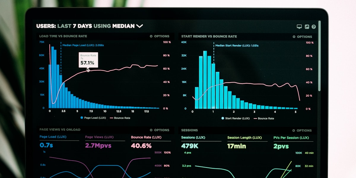
A one-second delay in page load time can reduce conversions by 7%. Compress images, minimize code, use caching, and choose quality hosting. Speed isn't just a technical concern. It's a conversion factor.
6. Create Urgency and Scarcity
Limited-time offers, countdown timers, and stock indicators encourage immediate action. But use these tactics honestly. Fake scarcity damages trust and your brand reputation.
7. Perfect Your Mobile Experience
Mobile visitors often have higher intent but lower conversion rates due to poor mobile experiences. Ensure buttons are large enough to tap, forms are easy to complete, and pages load quickly on cellular connections.
8. Use Directional Cues
Arrows, lines, and even the direction of people's gaze in photos can guide visitors' attention to important elements. Subtle visual cues help direct the eye to your CTAs and key messages.
Test and Iterate
What works for one business may not work for another. Use A/B testing to validate design decisions. Test headlines, CTAs, layouts, and colors to continuously improve conversion rates.
Written by
Emily Rodriguez
UX Designer
Emily Rodriguez is a seasoned professional at SiteFyd, bringing expertise in web design, development, and digital strategy to help businesses succeed online.
Share this article
Comments (0)
Leave a Comment
Be the first to comment on this article!
You Might Also Like
Hand-picked articles based on shared topics with this post.